Not everyone sees the internet you see: Part 1
-

- August 27, 2024
I’m often emailed requests to complete forms for my children’s schools. Since I work online, I’m usually among the first to open the email and click the link to view the form. More often than not, when I open the form, I see something like this:
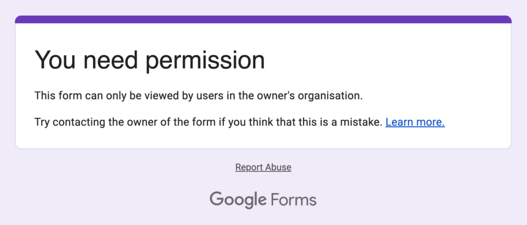
I wait a few minutes and then email the teacher to tell them about the issue. They’re always very grateful, and I hope that few others encountered the problem before it was fixed. Any friction like this can reduce the completion rates. Others who see this message might think the error was their fault and could give up.
The fix for the teacher is simple—just change the default form permissions to be accessible by anyone, not just those within the school. It’s easy to forget that what we see online isn’t always what others see.
When we design websites, we always take this into account. For example, we test on different devices, operating systems, browsers, and screen sizes, including browsers within apps. Sometimes, this involves checking with ads blocked and unblocked, common browser extensions, or viewing them using a VPN.
When we work on newsletters, we test every single link in the email every single time to ensure it works as expected. (It’s surprising how often a link can have a slight issue!) We also never assume that people have read earlier emails, so we always repeat or link to key information previously sent. This approach provides multiple opportunities to reinforce your message.
When we work on forms, we test them across different devices, operating systems, browsers, and screen sizes to ensure the entire process works smoothly. Can anything be simplified—what information needs to be collected? Are the confirmation links easily clickable? Is the correct ebook sent? Are people added to the right lists? What do the error messages look like, and are they helpful? Are form notifications sent to the right people? Is all the information up to date?
We work on a large-scale questionnaire for children, and adding a new question is a rigorous process. A team of skilled questionnaire developers carefully critiques the wording to ensure it is clear and understandable for a broad range of abilities. This may involve defining terms, providing examples, and narrowing the scope of the question. The questionnaire is then tested in classrooms to gather additional feedback. Often, children respond to a question with, ‘But what about….?’ or ‘Does … count?’—highlighting how they may interpret the question differently (and sometimes quite creatively!) compared to adults.
We recently worked with two clients who embedded third-party pop-ups on their websites. The first pop-up looked great in the mailing list client preview, but the tightly fitting text wrapped awkwardly when added to the site. The solution was simple—reduce the text size slightly to allow for some flexibility, as fonts can render differently for everyone. The second giant pop-up looked good on our client’s large screen but did not fit on many of our test screens; the form fields were hidden and inaccessible, rendering the form ineffective. This time, the solution was more involved—the pop-up needed to be redesigned to ensure it would work for everyone.
This attention to detail in testing ensures a smooth user experience. In a world where overwhelm and frustration levels are growing, any opportunity to improve your users’ experience is invaluable.
Get our articles straight to your inbox
This article first appeared in our thoughtful weekly-ish newsletter with insights (no hype!) on improving your website. Subscribe now!
Rachel Cunliffe
Rachel is the designer at cre8d. Her design aesthetic is clean, clear, and creative, ensuring your site is fast, user-friendly, and optimized for search. She lives with her husband and four children on a small farm in New Zealand.